Are you looking to enhance the conversion rate for your business?
Then, You landed at the right place! We have some very authentic and proven strategies for conversion rate optimization.
This post will highlight some of the proven ways that help to boost the conversion rate of your website.
What is the conversion rate?
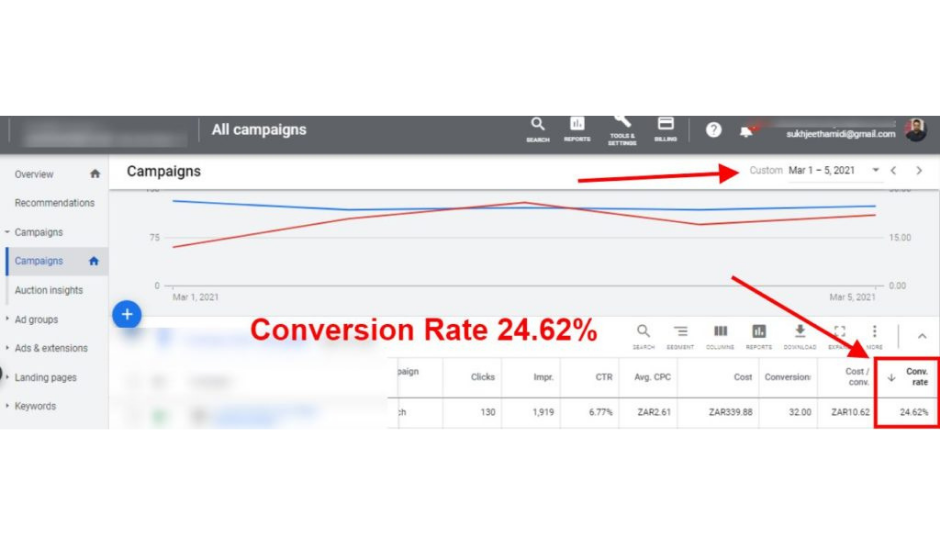
Conversion rate can be defined as the percentage of visitors to your website, who have fulfilled the desired action such as filling a contact form, making an inquiry call, subscribed for the newsletter, and so on, from the total number of visitors.
How to calculate conversion rate?
The conversion rate is the number of conversions divided by the total number of visitors. For example, if a website receives 200 visitors in a day and 50 have taken the desired action, the conversion rate would be 50 divided by 200 which is equal to 25%.
Here are some tips to increase the conversion rate:
1) Pay Attention To The Design Of Your Landing Page
Everyone knows that a less impressive design does not inspire users to take the desired action on the landing page! Therefore, one needs to ensure that the landing page design should be clear, concise, and comprehensible.
To create an impact-full design:
- Harmonize the themes and colors.
- Clearly differentiate the “titles” of the paragraphs.
- Play on shapes and symmetry.
- Remember to let your text breathe (in other words, make your content more easily readable).
2) Insert Your Calls-To-Action In People’s Natural Eye Path
CTA placements have a profound effect on the number of leads you are generating from your site. And yet, not many marketers are spending a lot of time thinking about, testing, and tweaking CTA placements in order to optimize their conversions.
In fact, many marketers claim that placing the CTA above the footer alone is good enough. This, however, is not true!
Start your CTA placement tests by placing them along the natural eye path of the website visitors. An eye-tracking study reveals that when people read a web page, they generally start by looking at the upper left-hand corner of the page, and this is an ideal location for CTA placements.
3) Use Pop-Up And Slide Forms The Right Way
Pop-ups do work and can be turned into an essential part of the inbound strategy when they are used in a way that is helpful and not disruptive.
So, if you are wondering whether you should be using pop-up forms, the answer is yes! However, care must be taken to ensure that the pop-ups offer something valuable and relevant to the people visiting that page.
4) Make it Easy to Request For a Free Quote
Give your customers the opportunity to get a free quote for your services. Make an easy, inviting landing page, showing the benefits your service offers. Get leads to follow up with potential new customers.
5) Focus on The Benefits
As for the calls to action, highlight the benefits that your visitors will get if they sign up for your newsletters or share their contact information.
Without a relevant value proposition, your visitors will not want to share their crucial data. To increase your number of leads, do not hesitate to offer a really valuable element such as an e-book, a newsletter, or even a free trial.
6) Optimize Landing Page for Mobiles
While the proportion of mobile users varies by industry, many websites see 60% or more of their traffic coming from mobile devices.
When you create a form, ensure that it is mobile-responsive and that its mobile view is optimally enhanced.
For even better results, you can create forms specifically designed for mobiles. This ensures optimal customer satisfaction.
7) Add Testimonials From (Real) Customers
Customer testimonials work as social proof. It helps to win the trust of new users. Positive feedback from existing customers, allows new users to contact the website owner with greater confidence.
Implementing the above tips is a great way to turn your landing page into a highly desirable one and finally enjoy a greater conversation rate for your business.


Leave A Comment